Petra Šorn

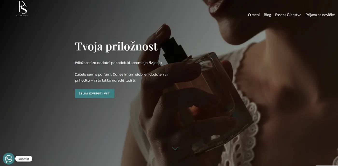
On the PetraSorn.com project we had a clear goal: to turn an old, outdated web presence into a website that reflects Petra’s work, expertise and personal approach. No empty steps, no needless philosophising – just precise, clean and technically flawless work.
Setting up a new structure and clean branding
Petra wanted a site that wouldn’t be “over-inflated”, but clear, well organised and professional. So we took the basic structure, cleaned it up and redesigned the core:
– About me,
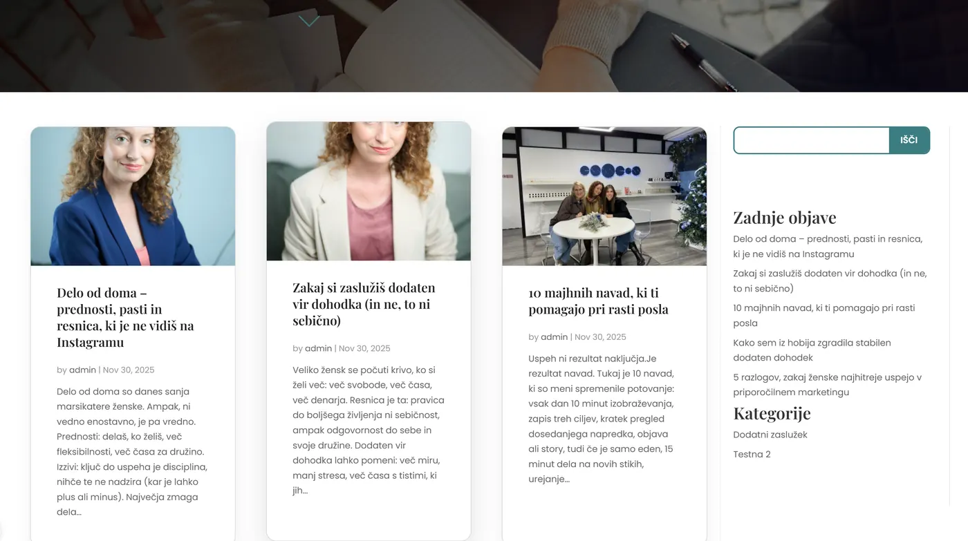
– Blog,
– Contact
plus a specially prepared, hidden section for her upcoming book.
We chose a minimalist design built on three key colours: pure white, an elegant teal (#3C7D82) and a contrasting black for headings. Colour-consistent branding was essential, so we also sorted out the typography, spacing, CTA buttons and the overall “scent” of the whole identity.
Optimising user experience and responsiveness
The site isn’t built just to look pretty, but to actually be used.
We adapted the layout so that everything scales nicely on mobile devices.
We added fixes to prevent horizontal scrolling, optimised the parallax effects and adjusted the backgrounds so they display correctly on every phone.
Once everything ran smoothly on mobile, we moved on to the things the eye doesn’t see:
– loading speed,
– correct heading hierarchy,
– image compression,
– HTML and CSS optimisation.
Integrations and the technical backbone
The site runs on WordPress, so we took care of:
– a safe setup on a temporary domain (petra.me2d.si),
– the later move to the main domain petrasorn.com,
– the correct DNS records,
– an SEO foundation and preparation for AI search engines,
– setting up Complianz (cookie banner, cookie policy),
– Mailchimp integration for Petra’s newsletter.
We also put a system in place that lets Petra add blog posts herself without any technical headaches.
The final look
When the site went live, it got what mattered most to Petra:
a site that feels professional, is technically stable, looks fresh and above all reflects Petra – not a generic template, not copy-pasted solutions, but entirely her own story.
For us, this project is another strong reference that proves that with the right approach, even very basic starting points can become a remarkably complete digital product.
Why this is a good reference
With Petra Šorn we showed three things we always stress at ME2D:
-
Clean execution beats unnecessary complexity.
-
Good design is logical, not just pretty.
-
A website must serve people, not the other way round.
PetraSorn.com is proof that a professional website can be built quickly, clearly and thoughtfully – and that every good story gets its own digital face if you go about things thoughtfully.