ŠMZD – Building a mini website

For the Šalek Valley Museum and Historical Society (ŠMZD) we made something that often looks simple but in reality takes a good deal of precision: a custom mini website that lives inside the existing Muzej Velenje system – without breaking the design, without duplicating content and without compromising the user experience.
This was not “just another subpage”. It was a mini ecosystem, tailored to the society yet entirely at home in the museum’s infrastructure.
What we actually did (no sugar-coating)
The brief was clear: the existing museum website stays untouched, while ŠMZD gets its own identity, structure and logic. The solution was not a new WordPress theme or yet another subpage full of generic blocks, but hand-built HTML and CSS components that slot neatly into the museum framework.
We built:
-
Custom navigation for ŠMZD that matches the main museum navigation visually and functionally, while clearly saying: “You are now in the society’s world.”
-
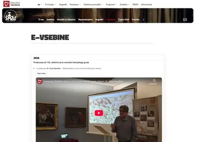
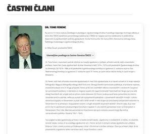
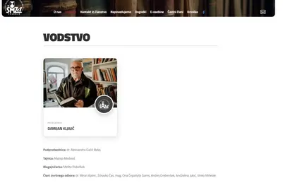
Dedicated content templates for the sections About us, Leadership, Honorary members, E-content, Events – each with its own logic and typography.
-
Hand-styled cards for the leadership and honorary members, with no page builder tricks and no inline chaos. Clean HTML, clean CSS, control over every edge and every gap.
-
E-content where video, text and the archive of years behave sensibly – on mobile devices too, which is exactly where pages like this love to fall apart.
-
Responsive adjustments so headings don’t run off the edge, images keep their proportions and content stays readable on a phone, not just on a 27-inch monitor.
These were those “little bits of CSS” nobody notices until they are missing – and then everything looks wrong.
Fitting into the Muzej Velenje environment
The project’s biggest value was not the build itself, but the integration. The ŠMZD mini website:
-
uses the museum’s server environment and core infrastructure,
-
respects the existing information architecture,
-
does not compete with the museum’s content, but complements it.
Users don’t consciously notice any of this, which is a good sign. Moving between the museum and the society feels natural, without the sense of “I’ve just jumped to another website”. That’s how it should be.
Why custom and not “quick and dirty”
Because a society is not a flyer. It has history, people, an archive, weight. And that shows in the details:
-
in the typography,
-
in the spacing,
-
in the fact that nothing feels random.
A page builder would have been faster. Cheaper, too. But the result would have been average. We chose the path where you control every line of code and every pixel. Yes, it takes longer. But a project like this also ages gracefully instead of falling apart after the first major update.
The end result
ŠMZD now has a standalone, clear and well-organised mini website that:
-
works as part of Muzej Velenje,
-
has its own identity,
-
is easy to extend in the future,
-
and above all: respects the content it presents.
-