
LUX Thai massage – brand identity
When we finished the website for LUX Thai massage in Dravograd, it was clear the story could not end there. A guest who visits the site on a phone should get the same feeling when holding a business card or a gift voucher, or when seeing a poster in the window. So we created a complete brand identity and a manual that keeps it all together.
It starts with the website
The identity grows out of the website luxthai.si: a dark brown background like a calm evening, gold like candlelight and cream surfaces like daylight. The design is calm, airy and precise, never loud. All printed materials use the same colours, typefaces and ornaments as the site.
The mark: lotus, arch and a figure in meditation
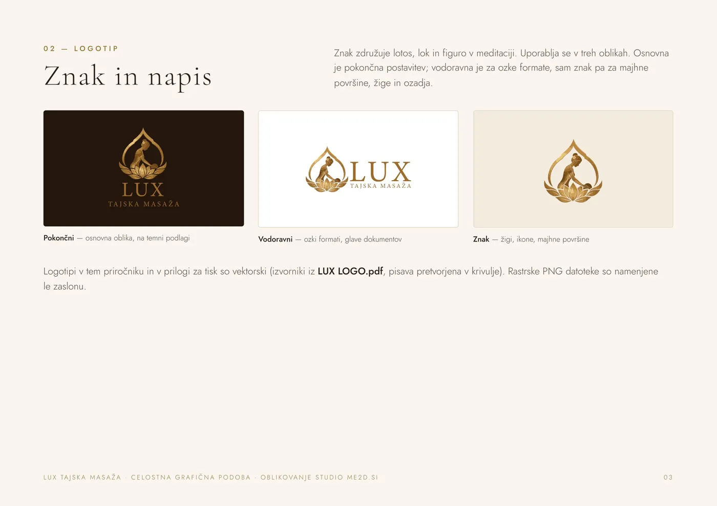
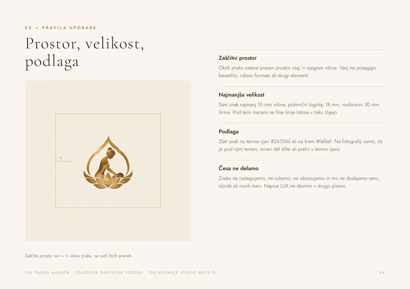
The mark combines a lotus, an arch and a figure in meditation. It comes in three forms: the upright layout is the default, the horizontal one is for narrow formats, and the mark alone is for small surfaces, stamps and backgrounds. The manual sets a clear space around the mark (a quarter of its height) and minimum sizes, because below 10 mm the fine lines of the lotus merge in print.
Colours, typefaces and ornaments
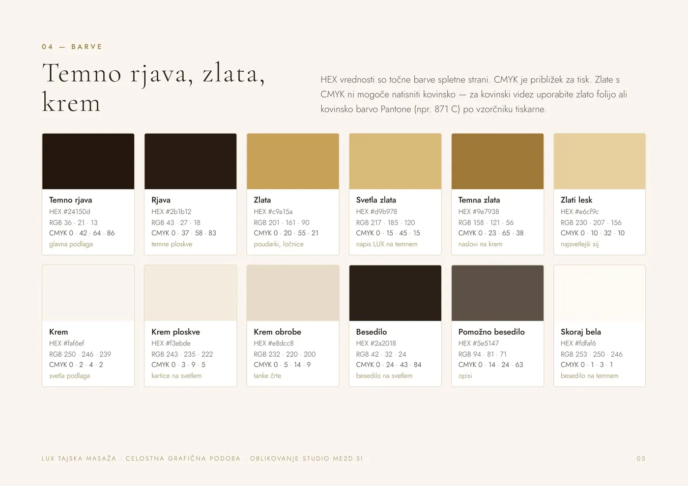
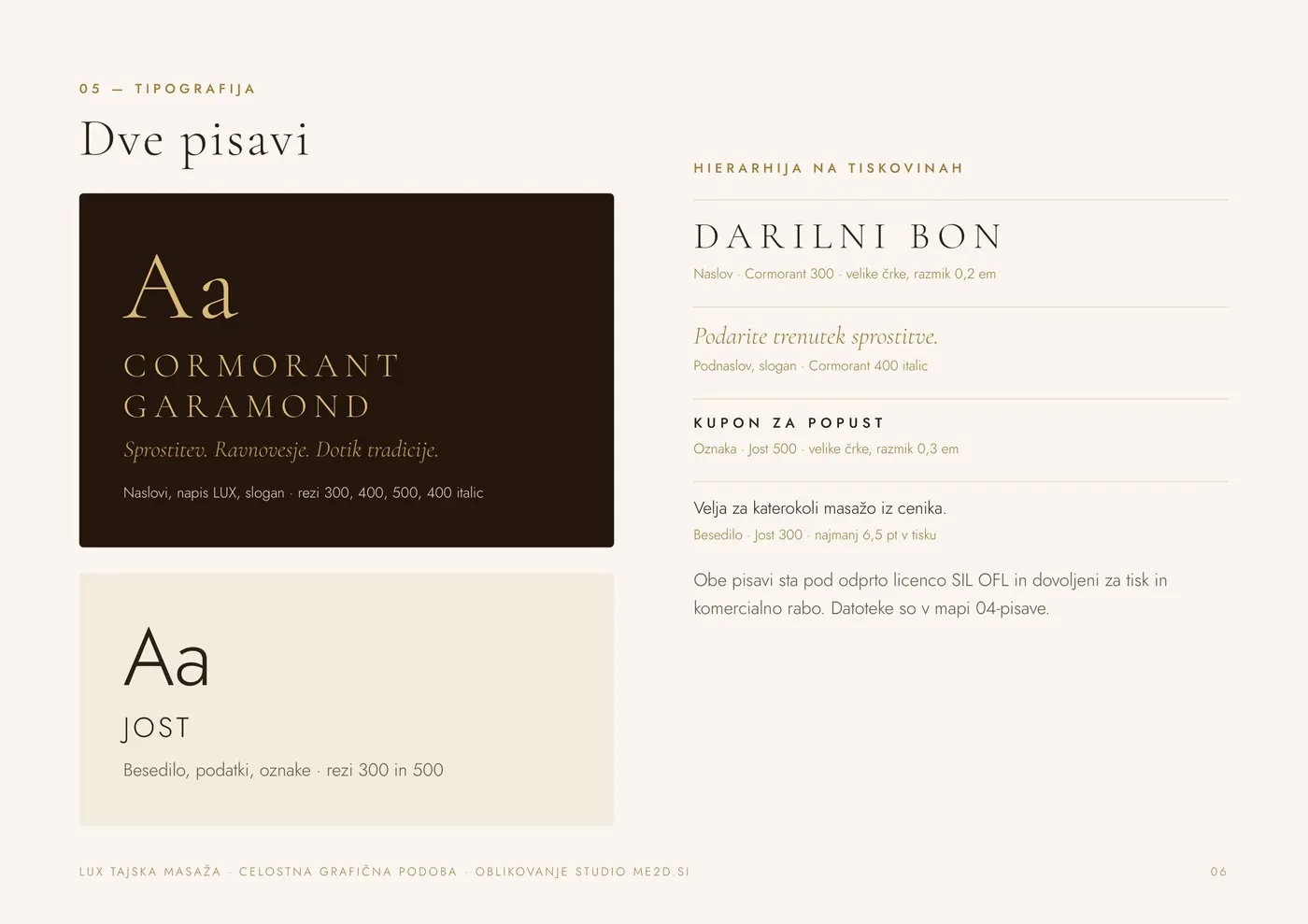
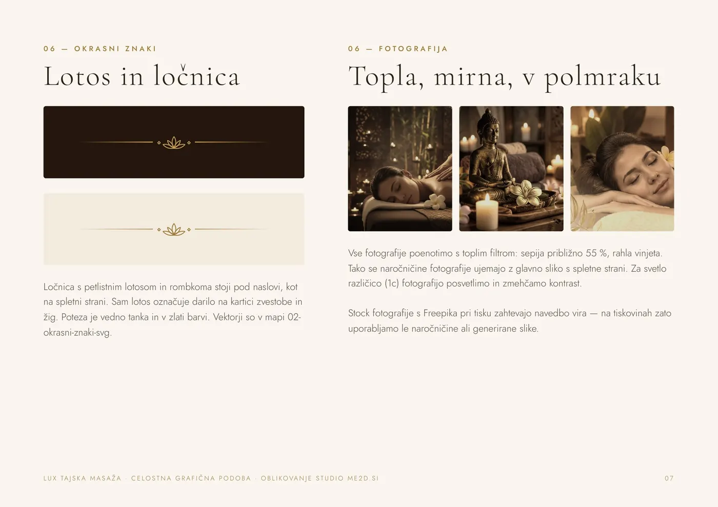
The palette is built on dark brown, several shades of gold and cream. Each colour has HEX, RGB and CMYK values in the manual. Since gold cannot be printed as metallic in CMYK, the manual recommends gold foil or a metallic Pantone ink for a metallic look. Headings are set in Cormorant Garamond and body text in Jost. A thin gold divider with a five-petal lotus sits under headings, and photos share a warm filter.
Business card, coupon and gift voucher
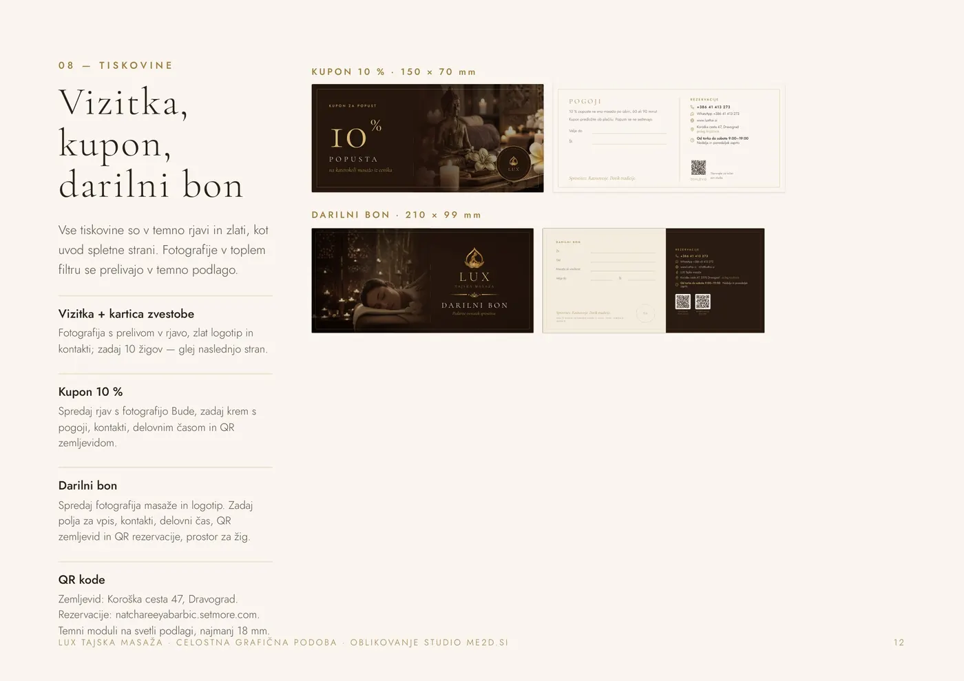
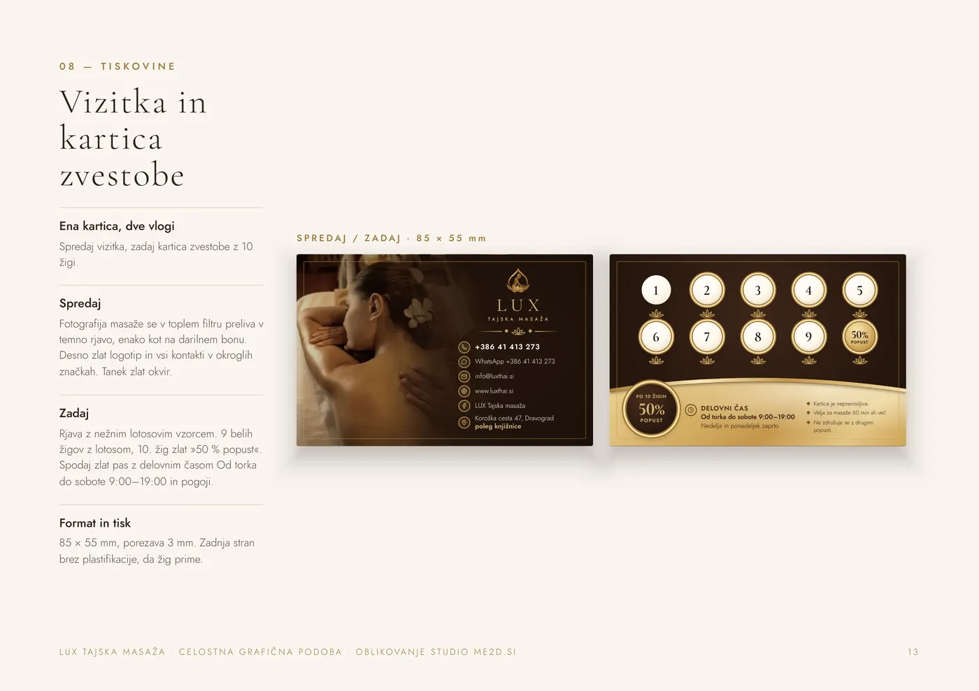
The business card does two jobs: contacts on the front, a loyalty card with ten stamps on the back, where the tenth brings a 50% discount. The back is left without lamination so the stamp holds. The 10% coupon and the gift voucher carry QR codes for the map and online booking on the back, and the voucher also has fields to fill in and room for a stamp.
Posters and Facebook cover
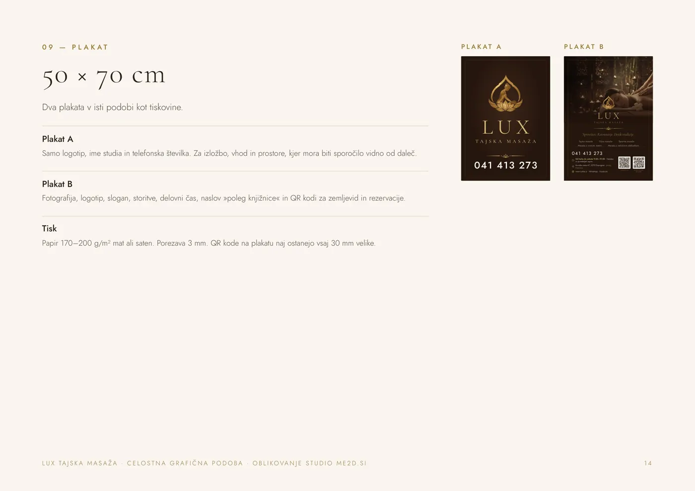
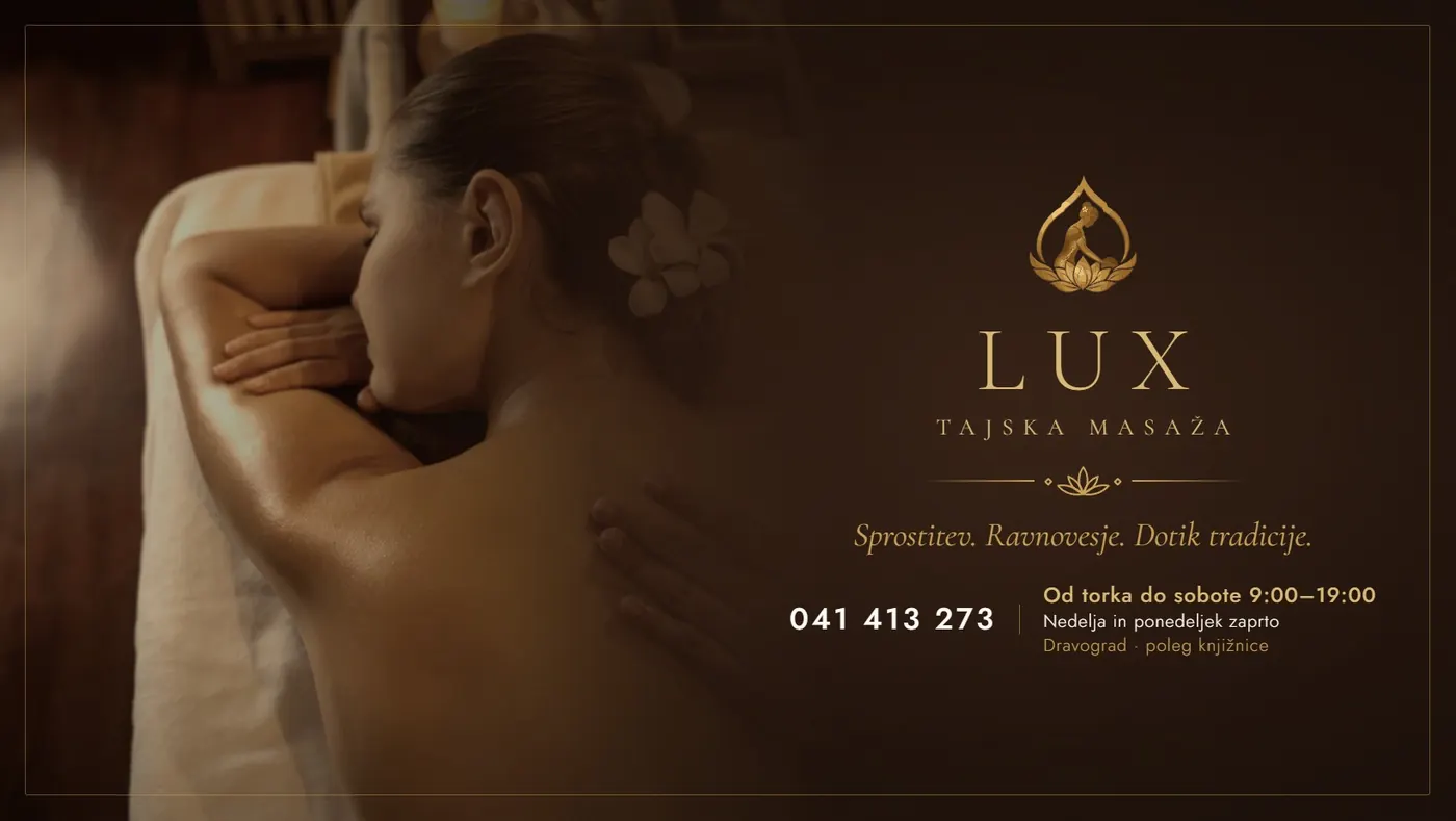
Poster A, 50 × 70 cm, shows only the mark, the name and the phone number, so it reads from a distance, for example in a window or at the entrance. Poster B adds a photo, the slogan, services, opening hours and two QR codes. The Facebook cover follows the business card and gift voucher, with all text kept inside the safe area that the profile picture does not cover on desktop.
The manual and print preparation
Everything is collected in a 16-page manual for the mark and print materials, together with print instructions: final formats, 3 mm bleed, CMYK conversion and gold foil preparation. That way the next print job can go to any print shop and still look like LUX.
Need a brand identity that looks the same on the web and in print? See what we do in graphic design and web, or have a look at the LUX project.


